Is My Country Happy?

Overview
While browsing Kaggle to look for datasets, I stumbled upon this dataset:

The dataset revolves around a country and its happiness score and I was intrigued by how exactly
this happiness score is calculated. Happiness is a very subjective topic and what makes a
person happy varies from person to person, so I took a look at the dataset to see what
it contained.
Before I go into investigating the data, I hypothesized that Healthy life expectancy is definitely going to be a big
factor in a country's happiness because if the average population of a country lives for a very long time,
naturally we can assume that they have been provided the resources to live long and happy. In order to verify
this conclusion I will have to determine what variables are strongly correlated. We're going to use data from kaggle
and use pandas for processing the data, sklearn to build a model and make predictions, and matplotlib.pyplot for plots
and visualizations.
Data
The data collected was surveyed from people within the country and then when asked the specific attributes from the
csv, people were told to rate that specific attribute on a scale of 0 to 10 where 10 is the best.
So after the dataset caught my eyes, I set up my environment and loaded the dataset of the world happiness
score from 2019 into pandas (link here)
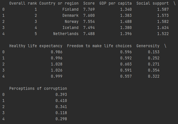
then I set the pandas settings to show all rows and cols and printed the dataframe, which gave me this:

This doesn't really tell us much about how these variables are related or if they even are related,
so let us put some data science skills to work.
Mean
Before we jump into figuring out how closely related variables are, lets take a look at the mean
of the dataset to get a taste out what our data is like. Running a quick df.mean() and looking
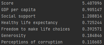
at the relevant fields we get:

Looks like on average, these are the numbers expected of an average country.
Correlation
The first thing I want to know is how closely related our variables are. I went on to find the correlation
coefficient of all the variables with respect to the country's happiness score. The correlation coefficients came out to be like this:

Score in this case is the happiness score, and here we can see that there are three variables/factors that are strongly
related to a country's happiness score. The factors that contribute most to a country's happiness score is: GDP per capita, social support, and healthy life expectancy.
Now that we know which variables are strongly related, we can use some visualizations to further investigate the trend of the data.
Visualizations
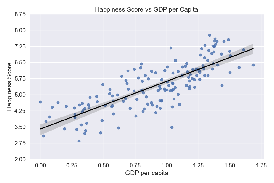
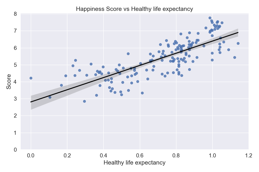
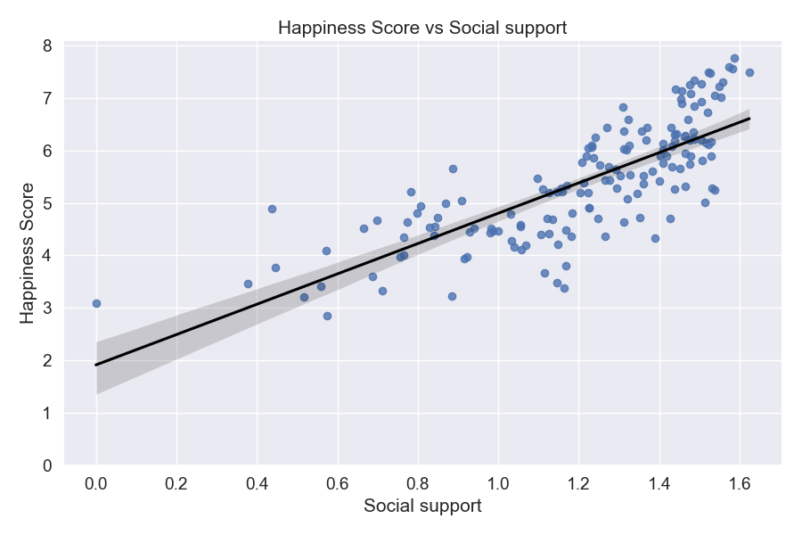
Here we want to do some plotting and see how our data looks like visually. Here are the three plots:
The plots above confirm that we do have a relatively strong positive correlation between the x and y variables.
From this we can conclude that GDP per capita, healthy life expectancy, and social support are all strongly positively associated
with each other. We also have some outliers that might affect our model's accuracy, but we can get rid of a few that are super far away
from the cluster of points to improve our model's accuracy. I chose to get rid of Somalia and Central African Republic as they had a GDP
of zero and GDP is the strongest factor in determining a country's happiness score.
Making Predictions (Using techniques)
Now that we have all the observations and data we need to build a relatively accurate model, I went on ahead and created a linear regression
model and used sklearns train_test_split to split our dataset into a training set and a testing set. After doing some research, I opted to use
a 80:20 train to test ratio. Using the x_test from train_test_split now we can see our predictions using our classifier's predict() function from sklearn's linear regression model:

This doesn't tell us much, so let us look at our model's accuracy instead by calling on our classifier's .score() function

We have a model accuracy of about 75%, which is pretty good.
Citations
- Professor Katherine's CSCI39542 Slides
- Matplotlib documentation
- Pandas documentation
